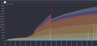
What is this graph showing?
This graph shows ADA distribution per address over time, which ends up being the balance per address. As the lower categories (small amounts) get thicker moving left to right, that indicates a more thorough distribution of Ada among the population of addresses and assumes more people are holding Ada. If the upper colours bands get thicker, that indicates Ada wealth is consolidating into fewer addresses and assumes fewer people or more whales.
Once Ada is used as a currency, expect the lower colour bands to become much broader due to an increase of smaller transactions to purchase products. If Ada becomes used as an investment strategy, expect the upper bands to get thicker as Ada accumulates in individual addresses.
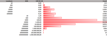
By enabling the legend you can see 16 (logarithmic sized) categories from single Lovelaces up to multi-billion holders.
Note: Cardano SL is UTxO based. So a single wallet can be summed up from at least one but also a very lot of single addresses. So having 10,000 addresses holding 1-10 ADA does not exactly indicate this is 10,000 user wallets.
Chart options
istoria history:
2019-04-20:
updated the stats, added Yoroi and Daedaus Milestones
2018-08-10:
lot of feedback implemented
- color scheme for categories
- categories aranged upside down
- legend values remain visible on mouse-out
- and of course fresh stats from the cardano SL blockchain :-)
2018-08-07:
added explanation about the graphs meaning (tnx Rick)
2018-08-04:
first version of this page with interactive graphs goes online
2018-08-01:
first YT video review
2018-07-14:
first attempt to display it graphically
2018-07-14:
istoria stats published on https://github.com/antipalos/istoria/tree/master/explorer and announced on cardano forum
Data extracted from Cardano Blockchain SL (Settlement layer): https://cardanoexplorer.com/